Introduction
RescueTime is a great way to keep track of how you are spending your screen time, whether you’re on a phone or laptop. However, while RescueTime displays how you are productive you are being online, the best way to analyze how you spend your screen time is to import your data into another platform like R and work with it there.
Part 1: Accessing your Data
There are two ways to retrieve your RescueTime data. Each have their own limitations. The first method is through the export functionality, which allows you to get all of your data, but does not attach productivity metrics and is aggregated by hour. The second method is to use the RescueTime API, which has productivity metrics, but you need a premium membership to retrieve more than the most recent three months of data. I’ll step though both methods.
Part 1a: Importing Via Archive
Download Your Archive
To export your archive as a CSV file, navigate to www.rescuetime.com and go to “Account Settings”. Here, under the “Your Data” section you’ll find a link to “download your data archive”.
From here you can generate a complete archive for your logged-in time and download it (if regenerating you may have to refresh the page to see when the archive is finished).
Extract the folder to a convenient location and you should have all your activity in a single CSV file.
Import Archive into R
From here, getting the data into R is the same process you would use for any other CSV file.
archive.data <- read.csv("../data/rescuetime-activity-history.csv", stringsAsFactors = FALSE, header=FALSE)

names(archive.data) <-  c("time", "activity","title", "category","domain", "duration")
str(archive.data)
## 'data.frame': 241 obs. of 6 variables:
## $ time : chr "2018-09-14 01:00:00 -0700" "2018-09-14 01:00:00 -0700" "2018-09-14 01:00:00 -0700" "2018-09-14 01:00:00 -0700" ...
## $ activity: chr "rstudio" "newtab" "docs.google.com/#document" "docs.google.com/#document" ...
## $ title : chr "C:/Users/Will/Desktop/Personal Projects/PersonalSite - master - RStudio" "New Tab - Google Chrome" "Google Docs - Google Chrome" "Untitled document - Google Docs - Google Chrome" ...
## $ category: chr "Software Development" "Utilities" "Design & Composition" "Design & Composition" ...
## $ domain : chr "Data Modeling & Analysis" "Browsers" "Writing" "Writing" ...
## $ duration: int 306 18 11 10 3 3327 114 43 26 15 ...Part 1b: Importing Via API
Get your API Key
First you have to get your API key.
Go to the API key manage page on the RescueTime website: https://www.rescuetime.com/anapi/manage
Here you’ll see all the keys RescueTime has integrated with. Make a new key, give it an appropriate label, and you can use it for all your API calls.
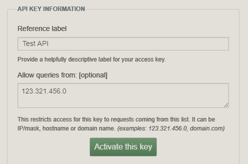
RescuetTme Key Example
Query API From R
Now that you have an API key, you can use that to query for your data.
library(tidyverse)
library(stringr)
library(httr)
library(jsonlite)
library(lubridate)
rescue.api.key <- "[your key here]"There are many requests you can use to retrieve the data you need. Find the whole list in the RescueTime documentation here. I’m going to request data in the same format as the archive by using perspective = ‘interval’ and resolution_time = ‘hour’. Note that if you change from ‘hour’ to ‘minute’, entries will be aggregated over 5 minute intervals.
start.date = as.Date("2018-08-16")
end.date = today()
connection.url <- 'https://www.rescuetime.com/anapi/data'
query.params <- list()
query.response <- GET(connection.url,
                      query = list(
                        key = rescue.api.key,
                        perspective = "interval",
                        resolution_time = "hour",
                        format = "csv",
                        restrict_begin = start.date,
                        restrict_end = end.date
                      ))
Format Data
parsed.data <- content(query.response, "parsed")
#rename columns
names(parsed.data) <- c("date", "duration", "people", "activity", "category", "productivity")
#save for later
saveRDS(parsed.data, "../data/rescuetime_api.rds")
Run Analysis
Now that you have data in R you can run more complex analysis. Based on which method you used to retrieve your data, you’ll have different options for analysis. I’m going to use GGPlot2 to confirm we get the same results as the RescueTime dashboard.
Pick a date in both the API time period and the archive time period.
test.date <- '2018-09-14'Recreate Category Time
With category and time data we should be able to recreate this graph. 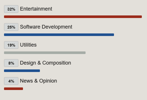
#use quo method (quote/un-quote) to filter for variable test.date value
date_col <- quo(date)
archive.data.test.date <- archive.data %>%
  mutate(date = date(time)) %>%
  filter( UQ(date_col) == test.date)
total.duration <- sum(archive.data.test.date$duration)
archive.data.test.date %>%
group_by(category) %>%
summarise(duration = sum(duration)) %>%
mutate(percentage = (duration/total.duration)*100) %>%
arrange(desc(percentage)) %>%
top_n(5, percentage) %>%
ggplot(aes(reorder(category, percentage), percentage)) +
geom_col(aes(fill = category)) +
coord_flip() +
labs(title="Top Categories", x = "Category", y = "Percentage") +
scale_fill_manual(values=c("#205190", "#9B2B1B", "#9B2B1B", "#205190", "#A5ACA6")) +
theme(legend.position="none")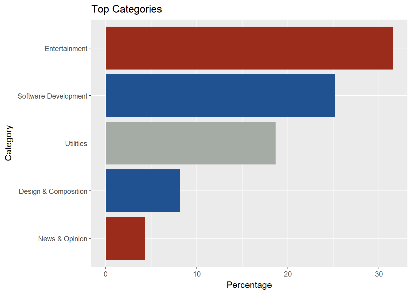 My graph doesn’t look quite as nice, but the values are the same so it looks like we have accurate data.
With the API data we have productivity metrics so we can replicate more of the dashboard.
Let’s try recreating the time by hour chart.
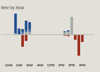
Rescuetime Graph
Creating a split bar chart can be tricky with GGPlot2 - thanks to rnotr for their great tutorial: http://rnotr.com/likert/ggplot/barometer/likert-plots/
First format the API data
#load from saved file
api.data <- readRDS(file = "../data/rescuetime_api.rds")

#change from integer to factor as an ordinal variable
api.data$productivity = fct_rev(as.factor(api.data$productivity))
#add hour and minutes and pick specific date
api.data.test.date <- api.data %>%
  mutate(date = date(time), hour = hour(time), duration_minutes = duration/60) %>%
  filter( UQ(date_col) == test.date)
In order to create the split bar chart we have to split the dataframe for what we want on top and bottom.
highs <- api.data.test.date %>% filter(productivity %in% c(0, 1, 2))
lows <-  api.data.test.date %>% filter(productivity %in% c(-1, -2))
#re-order the bottom variables so the more negative is stacked on bottom
levels(lows$productivity) <- fct_rev(lows$productivity)
Create the plot:
#negative bars mess with ordering of colors
ggplot() + geom_bar(data=highs,
                    aes(x = hour,
                        y=duration_minutes,
                        fill=productivity),
                    position="stack",
                    stat="identity") +
  geom_bar(data=lows,
           aes(x = hour,
               y=-duration_minutes,
               fill=productivity),
           position="stack",
           stat="identity") +
  geom_hline(yintercept = 0,
             color =c("#A5ACA6")) +
  scale_fill_manual(breaks = c("-2", "-1", "0", "1", "2"),
                        values=c("#9B2B1B", "#A5ACA6", "#587CAD", "#205190")) +
labs(title="time by hour", y="",x="") 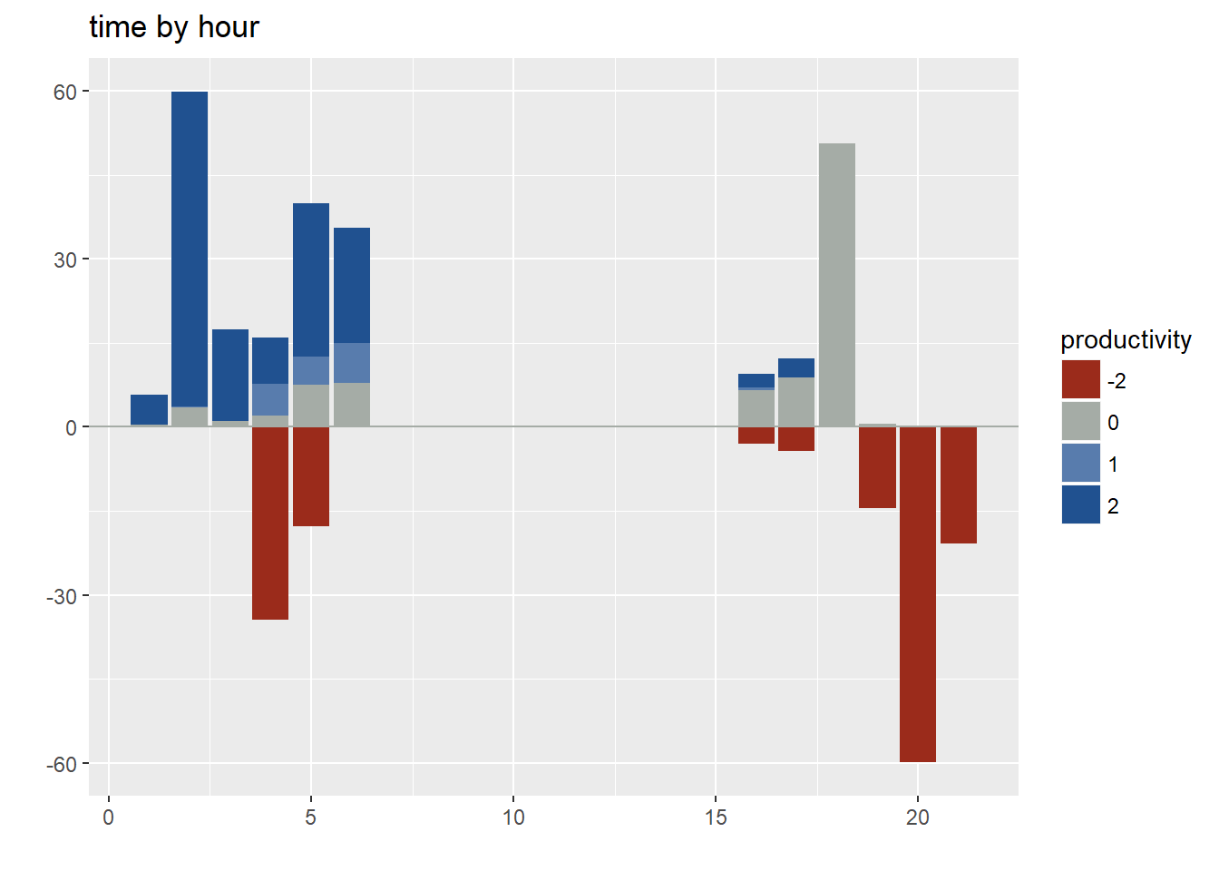
There is plenty more that can be done with this data, especially if you tie it together with other data sources. Feel free to explore and let me know what you come up with.