Introduction
Humans have always tried to predict the future. When the crop yield will be great, when storms will bring destruction, or when the stock market will crash. Something I don’t see people spending too much time trying to predict is personal actions. I am curious if we can use forecasting techniques to predict unproductive behavior before it happens. I decided to try my hand at forecasting my own productivity using a common time series method called ARIMA(auto-regressive integrated moving average). For most of this post I stepped through an overview by Ruslana Dalinina using a new set of data. I encourage you to check it out if you find the topic interesting and want more of the details behind the methodology.
ARIMA
If you have never heard of ARIMA before, I recommend going through a more detailed tutorial. Jason Brownlee wrote a good one for Python - How to Create an ARIMA Model for Time Series Forecasting in Python and Ruslana Dalinina has one for R - Introduction to Forecasting with ARIMA in R.
library(tidyverse)
library(lubridate)
library(ModelMetrics)
library(forecast)
library(tseries)
The Data
To get productivity metrics I am using RescueTime. You can find out how to get your own RescueTime data in my post How to Download and Analyze Your RescueTime Data in R. The data I’m using is retrieved from the API using a 5-minute interval. You can also use the archive functionality if you prefer.
head(rescuetime.data)## # A tibble: 6 x 6
## date duration people activity category productivity
## <dttm> <int> <int> <chr> <chr> <int>
## 1 2018-08-27 17:05:00 80 1 youtube.com Video -2
## 2 2018-08-27 17:05:00 11 1 Windows Exp~ General U~ 1
## 3 2018-08-27 17:05:00 4 1 system idle~ Other 0
## 4 2018-08-27 17:05:00 3 1 newtab Browsers 0
## 5 2018-08-27 17:10:00 299 1 youtube.com Video -2
## 6 2018-08-27 17:15:00 300 1 youtube.com Video -2First, we need to format the data as a time series.
#conver to integer
rescuetime.data$productivity <- as.integer(rescuetime.data$productivity)
rescuetime.data$time <- as.POSIXct(rescuetime.data$date)
#use weighted average for productivity
rescuetime.averaged.data <- rescuetime.data %>%
  group_by(time) %>%
  mutate(weighted_productivity= weighted.mean(productivity, duration)) %>%
  select(time, productivity=weighted_productivity) %>%
distincthead(rescuetime.averaged.data)## # A tibble: 6 x 2
## # Groups: time [6]
## time productivity
## <dttm> <dbl>
## 1 2018-08-27 17:05:00 -1.52
## 2 2018-08-27 17:10:00 -2
## 3 2018-08-27 17:15:00 -2
## 4 2018-08-27 17:20:00 -2
## 5 2018-08-27 17:25:00 -2
## 6 2018-08-27 17:30:00 -1.32Now we have our values and unique timestamps. However, if we convert to a vector, we don’t want to skip time slots from missing data. To avoid that, we can add in NA for missing timestamps. Here I’m using the zoo package to merge in the missing times.
library(zoo)

rescuetime.averaged.data.zoo<-zoo(rescuetime.averaged.data$productivity, order.by = rescuetime.averaged.data$time) #set date to Index
all.times <- seq(
      start(rescuetime.averaged.data.zoo),
      end(rescuetime.averaged.data.zoo)
      ,by="5 min")
filled.zoo <- merge(rescuetime.averaged.data.zoo,zoo(,all.times), all=TRUE)#empty second zoo with index of times
Convert the merged data back into a dataframe to view.
productivity.data <- data.frame(time = index(filled.zoo),productivity = filled.zoo)summary(productivity.data)## time productivity defaultCleanTs
## Min. :2018-08-27 13:05:00 Min. :-2.000 Min. :-2.0000
## 1st Qu.:2018-09-19 07:45:00 1st Qu.:-2.000 1st Qu.:-1.0714
## Median :2018-10-12 02:25:00 Median :-0.279 Median : 0.0000
## Mean :2018-10-12 02:25:00 Mean :-0.290 Mean :-0.1156
## 3rd Qu.:2018-11-03 21:05:00 3rd Qu.: 1.318 3rd Qu.: 0.8234
## Max. :2018-11-26 14:45:00 Max. : 2.000 Max. : 2.0000
## NA's :20181
## zeroCleanTs weekday customCleanTs
## Min. :-2.00000 Length:26241 Min. :-2.0000
## 1st Qu.: 0.00000 Class :character 1st Qu.: 0.0000
## Median : 0.00000 Mode :character Median : 0.0000
## Mean :-0.06688 Mean : 0.2912
## 3rd Qu.: 0.00000 3rd Qu.: 0.9444
## Max. : 2.00000 Max. : 2.0000
##
## maDayCustomClean hour
## Min. :-0.88623 Min. :2018-08-27 13:00:00
## 1st Qu.: 0.08002 1st Qu.:2018-09-19 07:00:00
## Median : 0.40819 Median :2018-10-12 02:00:00
## Mean : 0.29244 Mean :2018-10-12 01:57:30
## 3rd Qu.: 0.56642 3rd Qu.:2018-11-03 21:00:00
## Max. : 1.07134 Max. :2018-11-26 14:00:00
## NA's :288There are many NA’s, but we’ll deal with that later. Let’s see what the data looks like.
ggplot(productivity.data, aes(time, productivity)) + geom_line() + scale_x_datetime('hour') + ylab("Productivity") 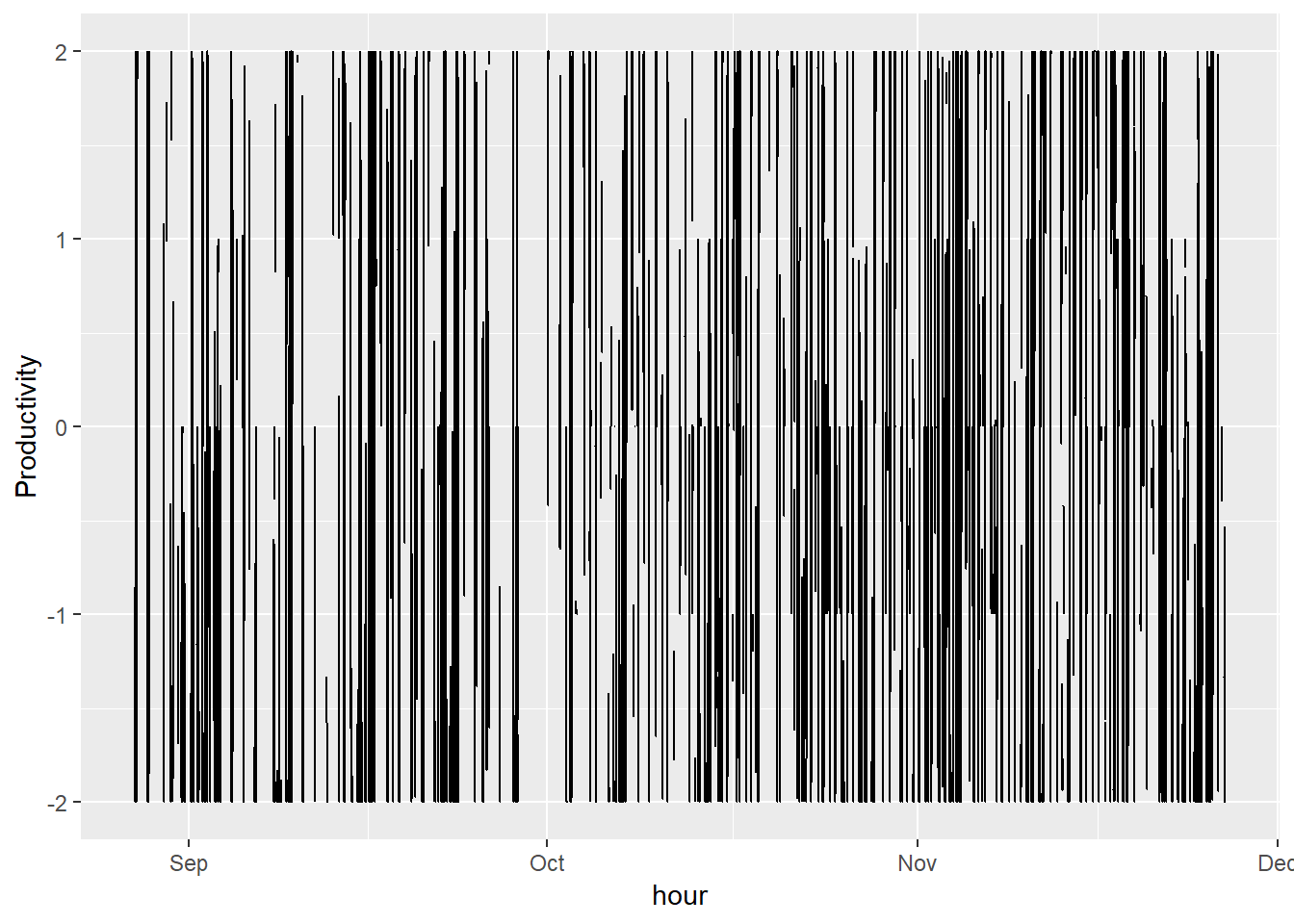
This graph is very messy. To keep things simple, I’ll just stick to viewing a couple weeks.
productivity.data %>%
  filter(time > ymd("2018-11-19")) %>%
  ggplot(aes(time, productivity)) + geom_line() + scale_x_datetime('hour')  + ylab("Productivity") +
            xlab("")
## Warning: package 'bindrcpp' was built under R version 3.4.4## Warning: Removed 5 rows containing missing values (geom_path).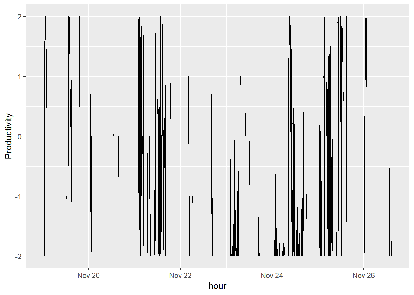
It’s not much better, but I’m still curious what I can get out of some time series methods. The series looks very volatile and there are many missing hours. We need to clean this data.
For now, I’m going to try 3 methods of imputing missing data: replacing with 0, using default methods, and using my background knowledge.
First, I’m going to use some default time series cleaning methods.
default.clean.ts <-  ts(productivity.data[, c('productivity')])

productivity.data$defaultCleanTs <-  tsclean(default.clean.ts)

productivity.data %>%
  filter(time > ymd("2018-11-19")) %>%
  ggplot() +
    geom_line(aes(x = time, y = defaultCleanTs)) + ylab('Average Productivity')
## Don't know how to automatically pick scale for object of type ts. Defaulting to continuous.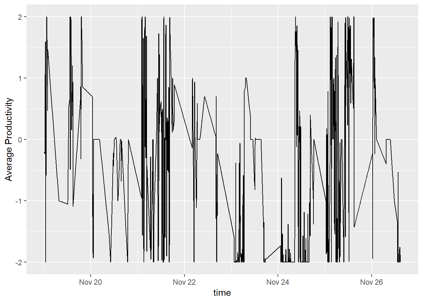
This graph looks better since we don’t have so many gaps in the data. However, it doesn’t really make sense. I am not slowly becoming more productive until I turn on the computer and go to willrenius.com to learn something. It would be more accurate to say that I am being neither productive nor unproductive until data is being tracked. Instead of using the default tsclean, we can try replacing NA with 0.
productivity.data$zeroCleanTs <-  productivity.data$productivity
productivity.data$zeroCleanTs[is.na(productivity.data$zeroCleanTs)] <- 0
productivity.data %>%
  filter(time > ymd("2018-11-19")) %>%
  ggplot() +
    geom_line(aes(x = time, y = zeroCleanTs)) + ylab('Average Productivity')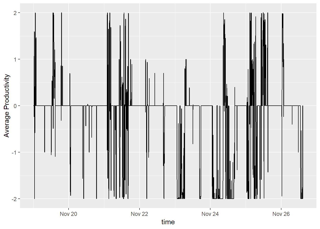
That’s better, but since I know my own schedule, I can use that knowledge to impute. I am not able to track my productivity during work hours; however, it’s a decent assumption that time during those hours is productive.
productivity.data$weekday <- weekdays(productivity.data$time)

productivity.data <- productivity.data %>%
  mutate(customCleanTs = case_when(
    !weekday %in% c("Saturday", "Sunday") &
      hour(time) > 8 &
      hour(time) < 17 &
      is.na(productivity) ~ 2,
    is.na(productivity) ~ 0,
    TRUE ~ productivity))

productivity.data %>%
  filter(time > ymd("2018-11-19")) %>%
  ggplot() +
    geom_line(aes(x = time, y = customCleanTs)) + ylab('Average Productivity')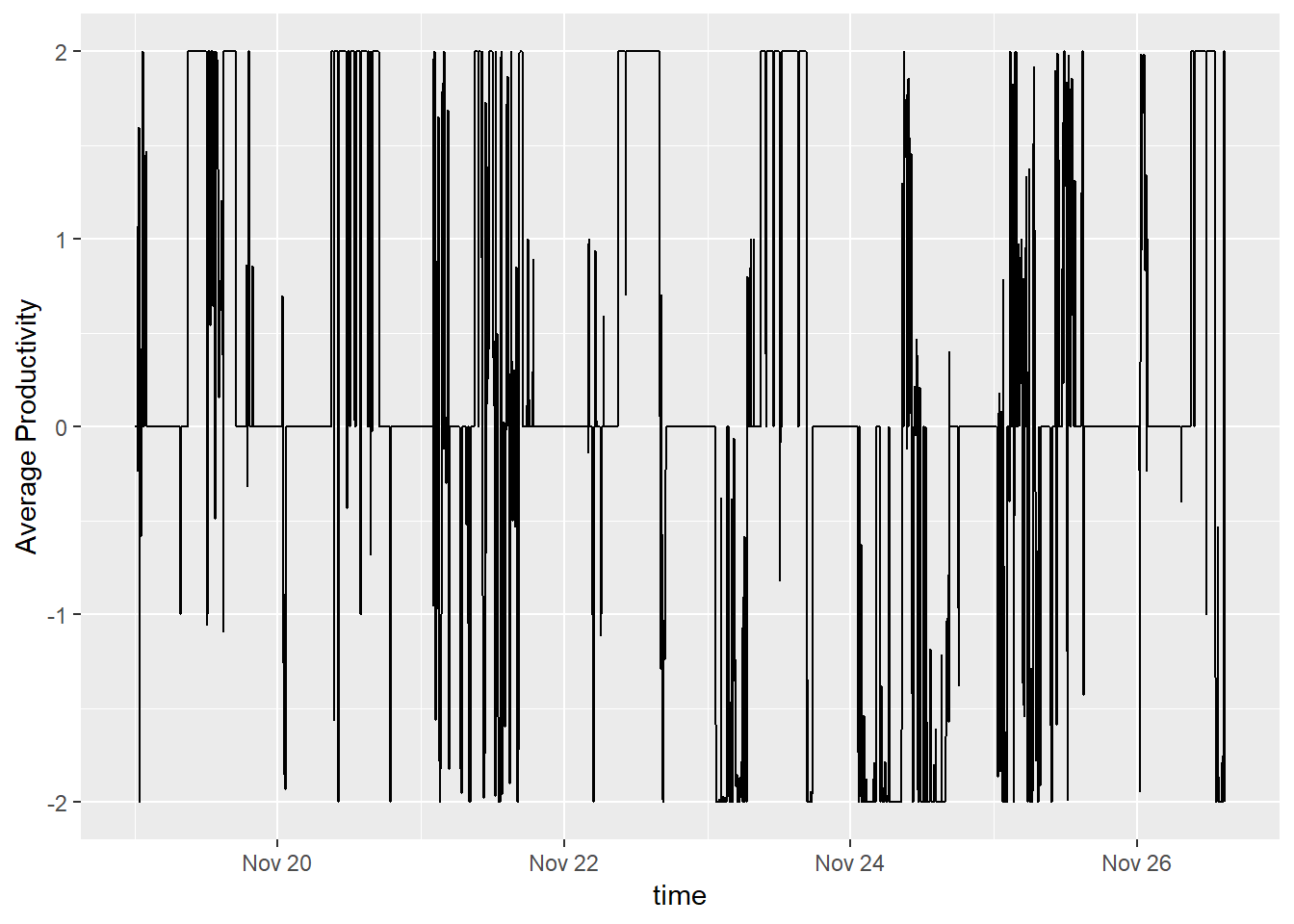
This data isn’t perfect. I know that no one is 100% productive at work and I am missing any holidays, vacations, or work events. However, it’s decent enough for me to move on. Let’s take a look at the moving average for our timeframe.
productivity.data$maDayCustomClean = ma(productivity.data$customCleanTs, order=288)

productivity.data %>%
  filter(time > ymd("2018-11-19")) %>%
    ggplot() +
      geom_line( aes(x = time, y = customCleanTs, color = "Custom Clean Productivity")) +
      geom_line( aes(x = time, y = maDayCustomClean,   color = "Custom Clean Daily Moving Average")) +
      ylab('Productivity')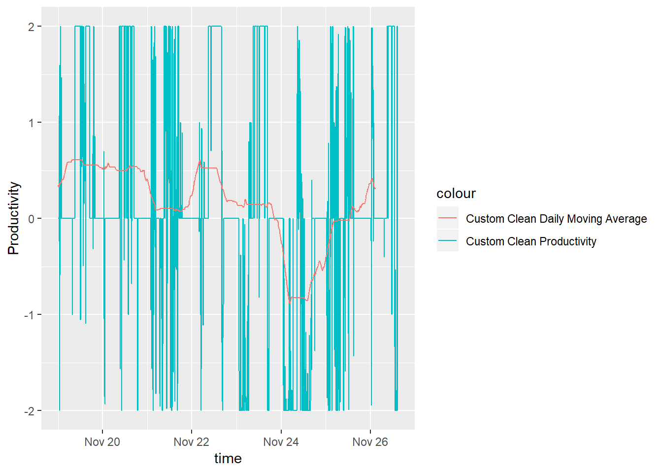
Analyze the Timeseries
Decompose
Before fitting, let’s get an idea of what our time series is. We can look at the components of our productivity time series.
#create a timeseries with a predefined frequencey (288 5 minute intervals in 1 day)
customCleanTs <-  ts(na.omit(productivity.data$customCleanTs), frequency=288 )
decomp <-  stl(customCleanTs, s.window="periodic")
plot(decomp)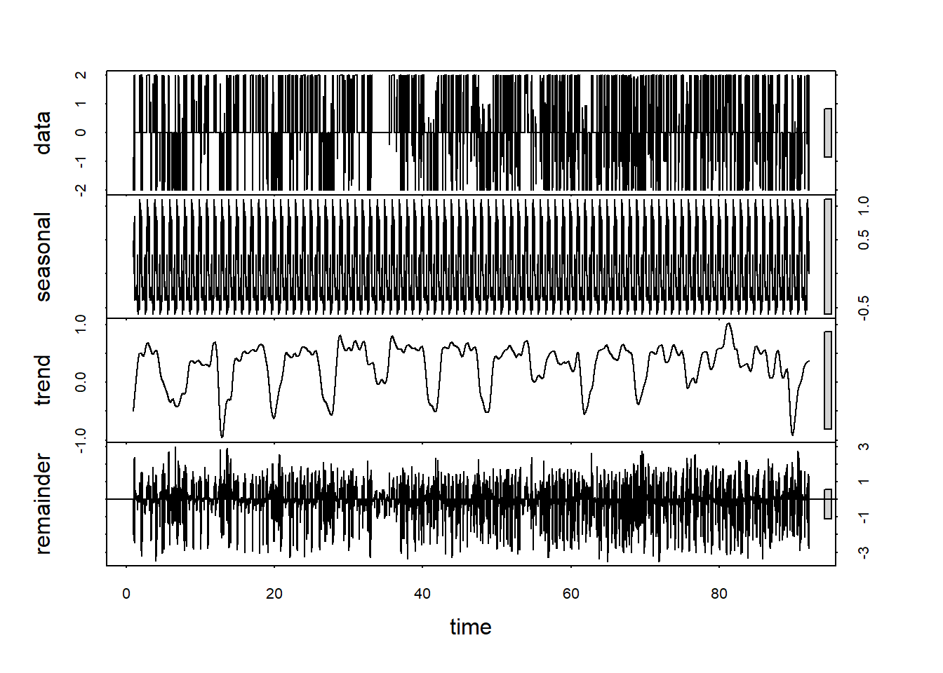
Or check if it is stationary
adf.test(customCleanTs, alternative = "stationary")## Warning in adf.test(customCleanTs, alternative = "stationary"): p-value
## smaller than printed p-value##
## Augmented Dickey-Fuller Test
##
## data: customCleanTs
## Dickey-Fuller = -19.646, Lag order = 29, p-value = 0.01
## alternative hypothesis: stationaryThe p-values is less than .01, so our time series is stationary according the the Augmented Dickey-Fuller Test.
We can use a couple plots to get an idea of what the ARIMA parameters should be. In the end we’ll be using auto.arima to discover the parameters for us. However, it’s still nice to see if what we see in the graphs match with what auto.arima finds. If you’re interested in finding out more on how to use Acf and Pacf to discover arima parameters, check out this tutorial by Duke University.
Acf(customCleanTs, main='ACF')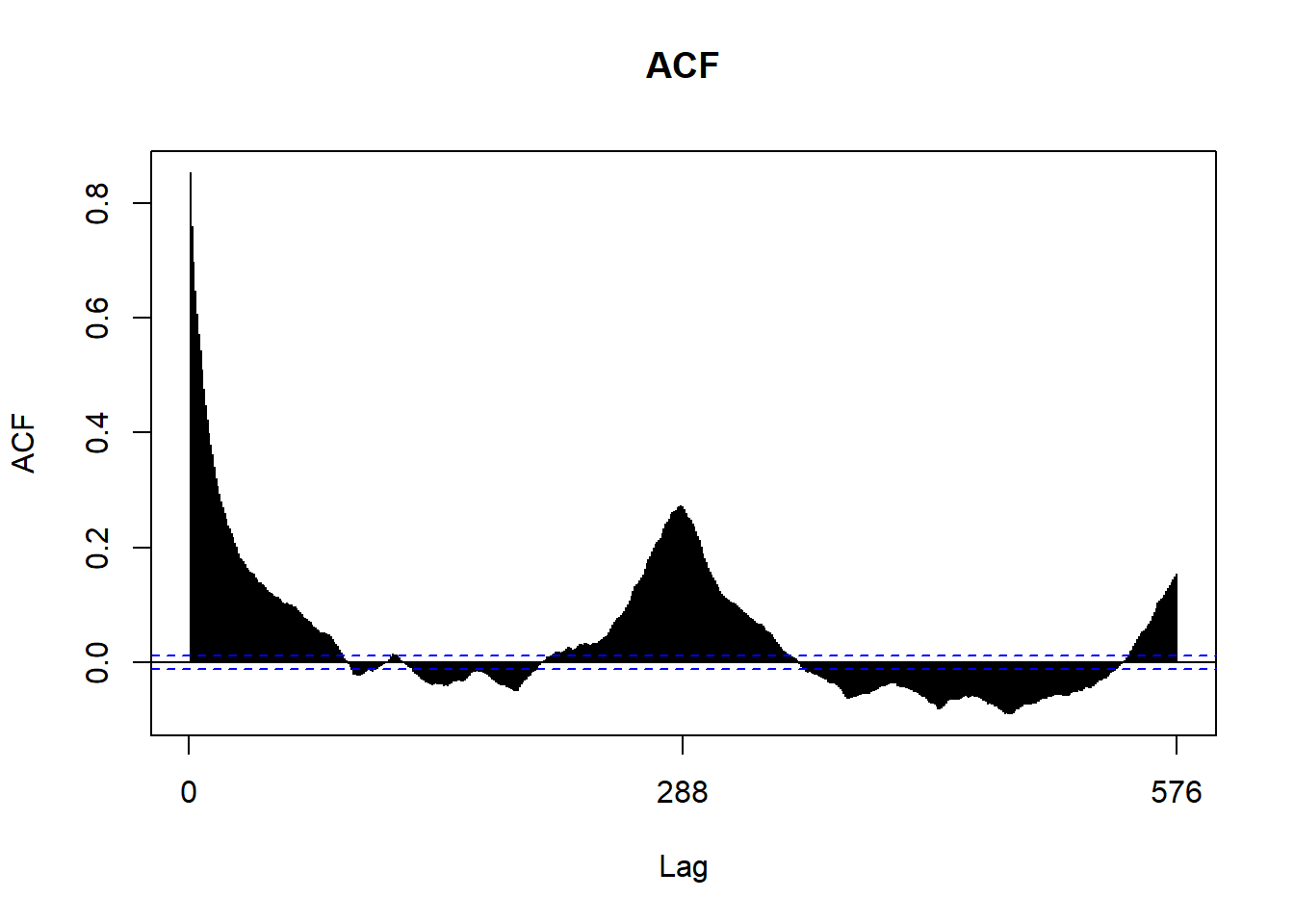
Pacf(customCleanTs, main='PACF')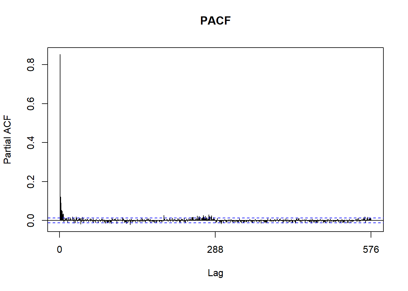
Fitting Arima
It’s finally time to fit an ARIMA model.
fit<-auto.arima(customCleanTs, max.p = 5, max.q = 5, num.cores=4)Let’s see the residuals.
tsdisplay(residuals(fit), main='Residuals')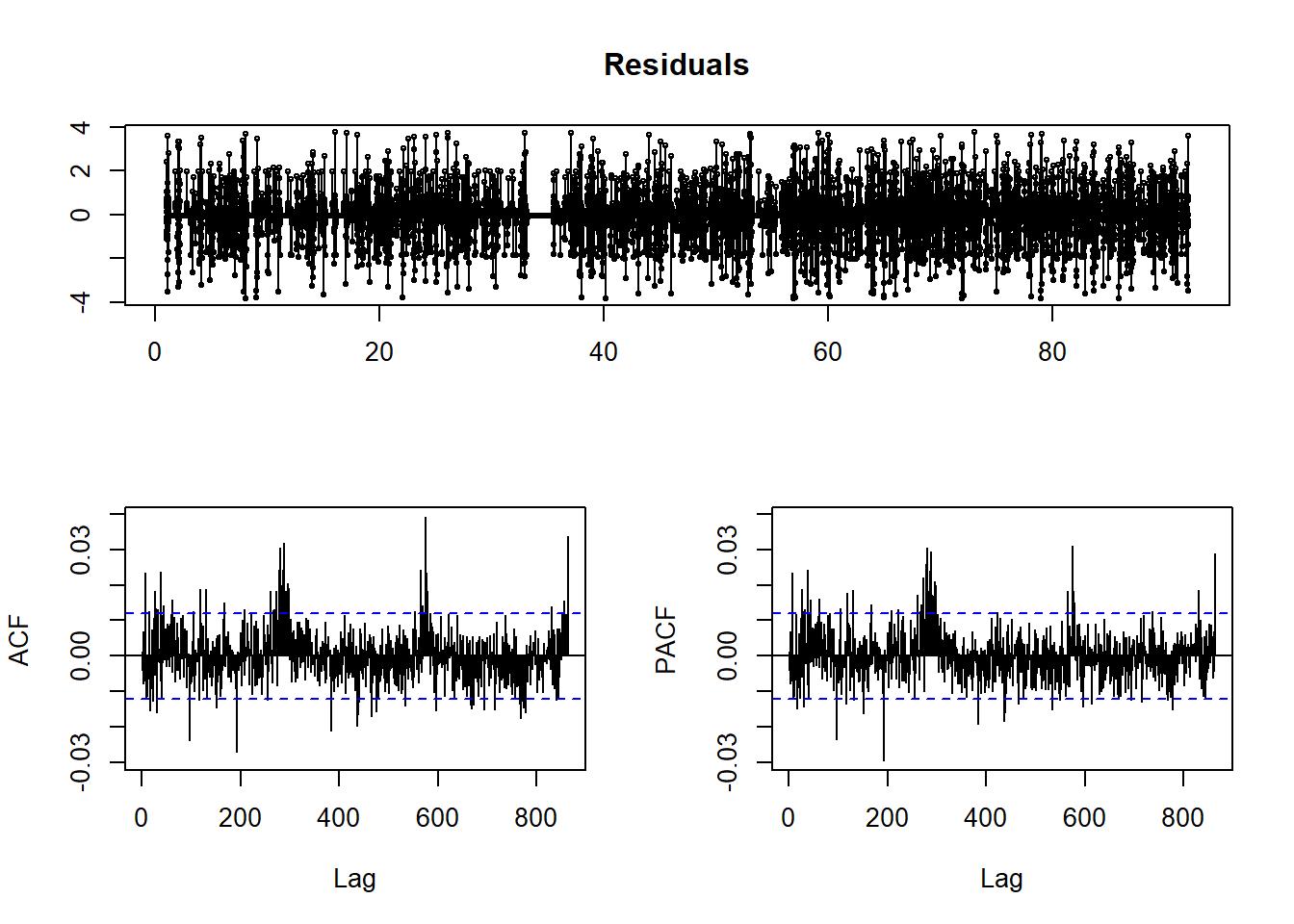
qqnorm(residuals(fit))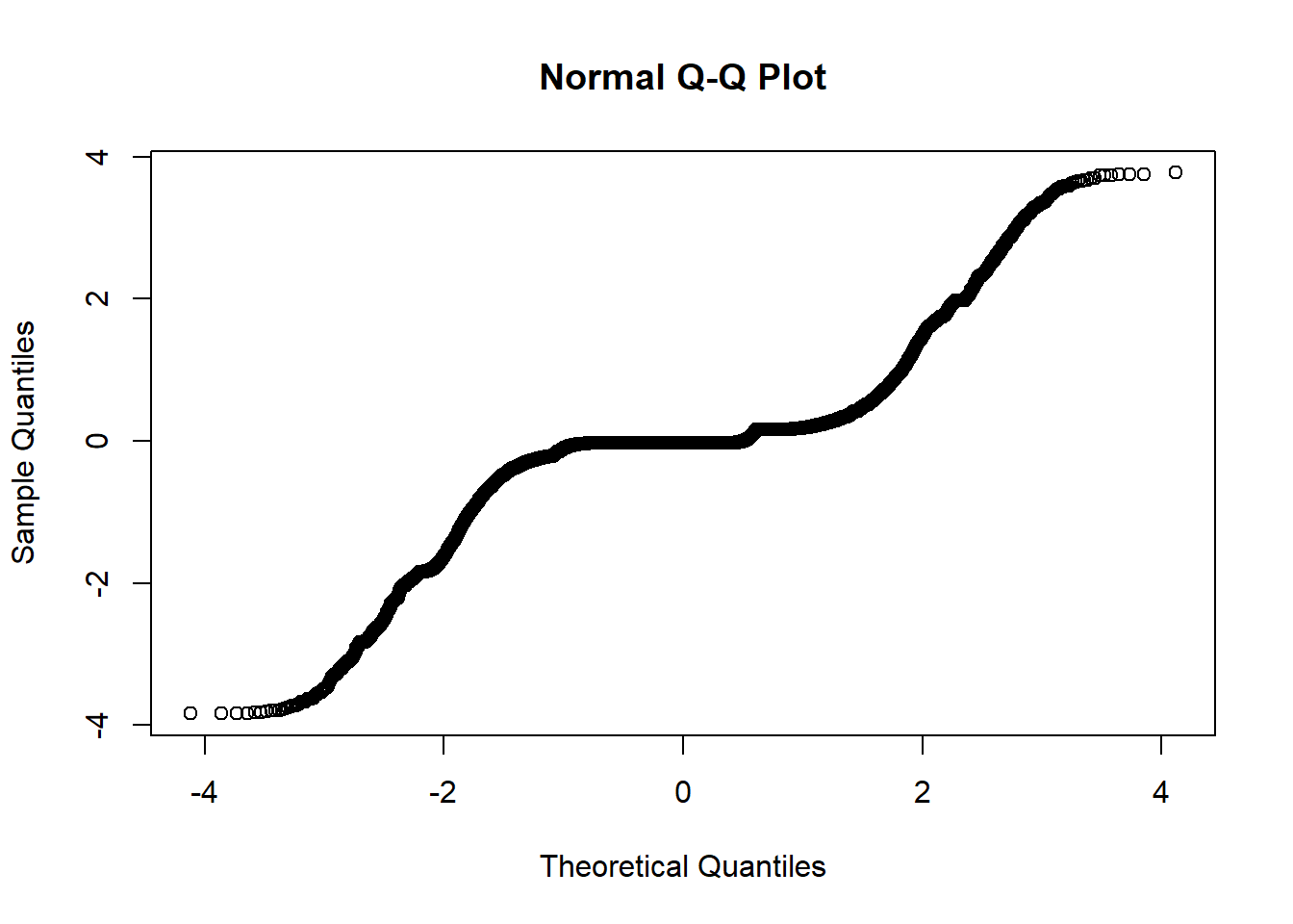
The residuals do not look good here. The qqnorm plot shows that they are not normal, and our ACF and PACF plots show significance at larger lags.
Now let’s see how close we can get to predicting the 2 weeks we have been looking at.
#Create Testing and Training Split
start.date <- "2018-11-19"

start.index <- min(which(productivity.data$time > ymd(start.date)))
test.data <- window(ts(customCleanTs), start=start.index)
train.data <- ts(customCleanTs[-c(start.index:length(customCleanTs))])

#fit with training data
training.fit <-  auto.arima(train.data, max.p = 5, max.q = 5, num.cores=4)

#forecast 1 week of data
train.forecast <- forecast(training.fit,h=length(test.data))
# saveRDS(train.forecast, file = "../data/daily_train_forecast.rds")
train.forecast <- readRDS("../data/daily_train_forecast.rds")plot(train.forecast)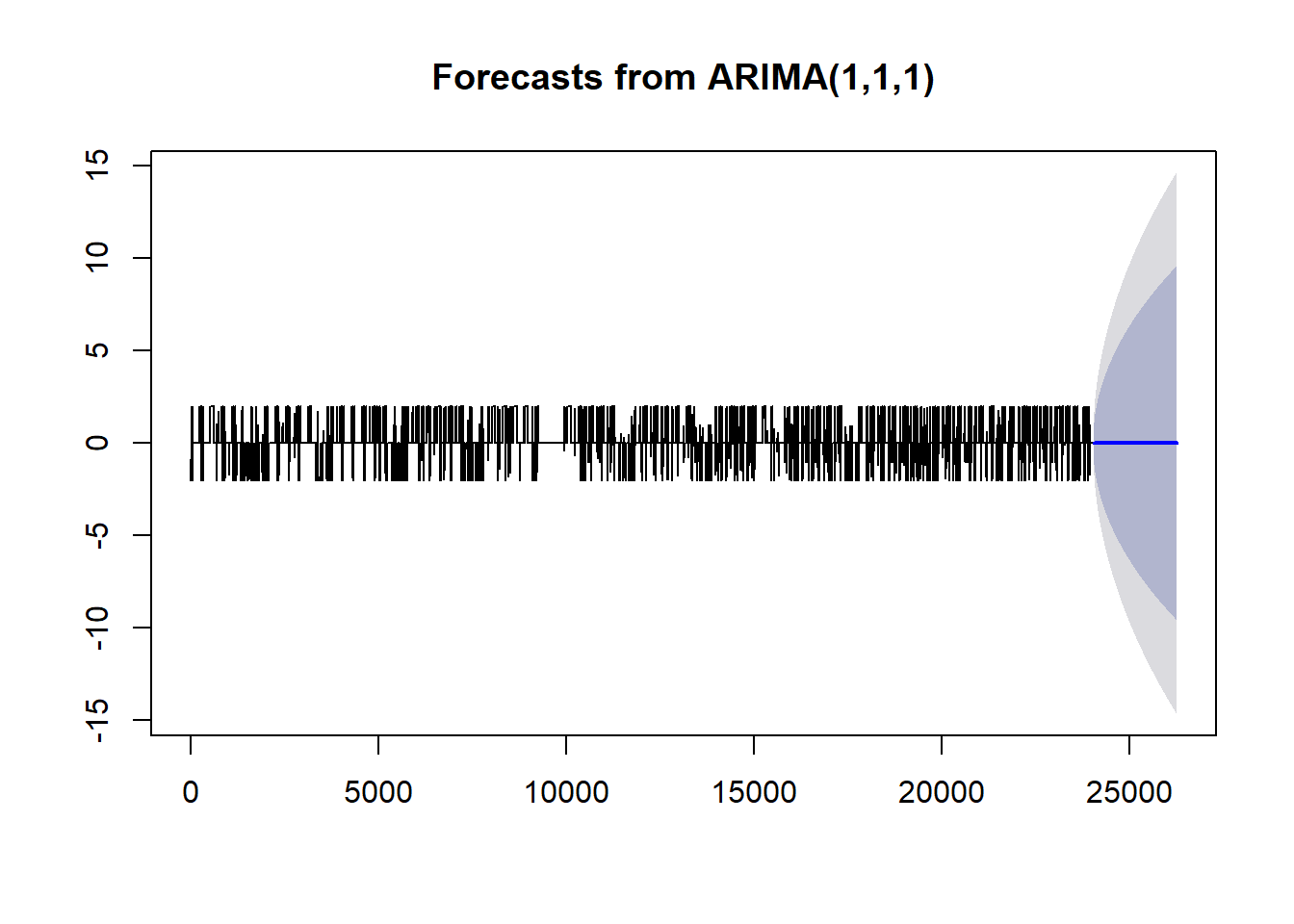
This forecast is not very impressive. We only see predictions of a constant productivity. Going back to the analysis, there were a few signs that showed we were off track. The Acf and Pacf plots showed significance a larger lags, the decomposition of our time series showed periodic behavior in our trend, and our residuals of the fitted arima were non-ideal.
One potential solution is to adjust the periods in our time series to be per week instead of per day.
For example, take a look at a cleaner dataset.
set.seed(1)
temps <- 20+10*sin(2*pi*(1:856)/365)+arima.sim(list(0.8),856,sd=2)

example.a <- forecast(auto.arima(ts(temps,frequency=30)), h = 365)
example.b <- forecast(auto.arima(ts(temps,frequency=365)), h = 365)
Both examples use the same data and only differ in frequency.
plot(example.a)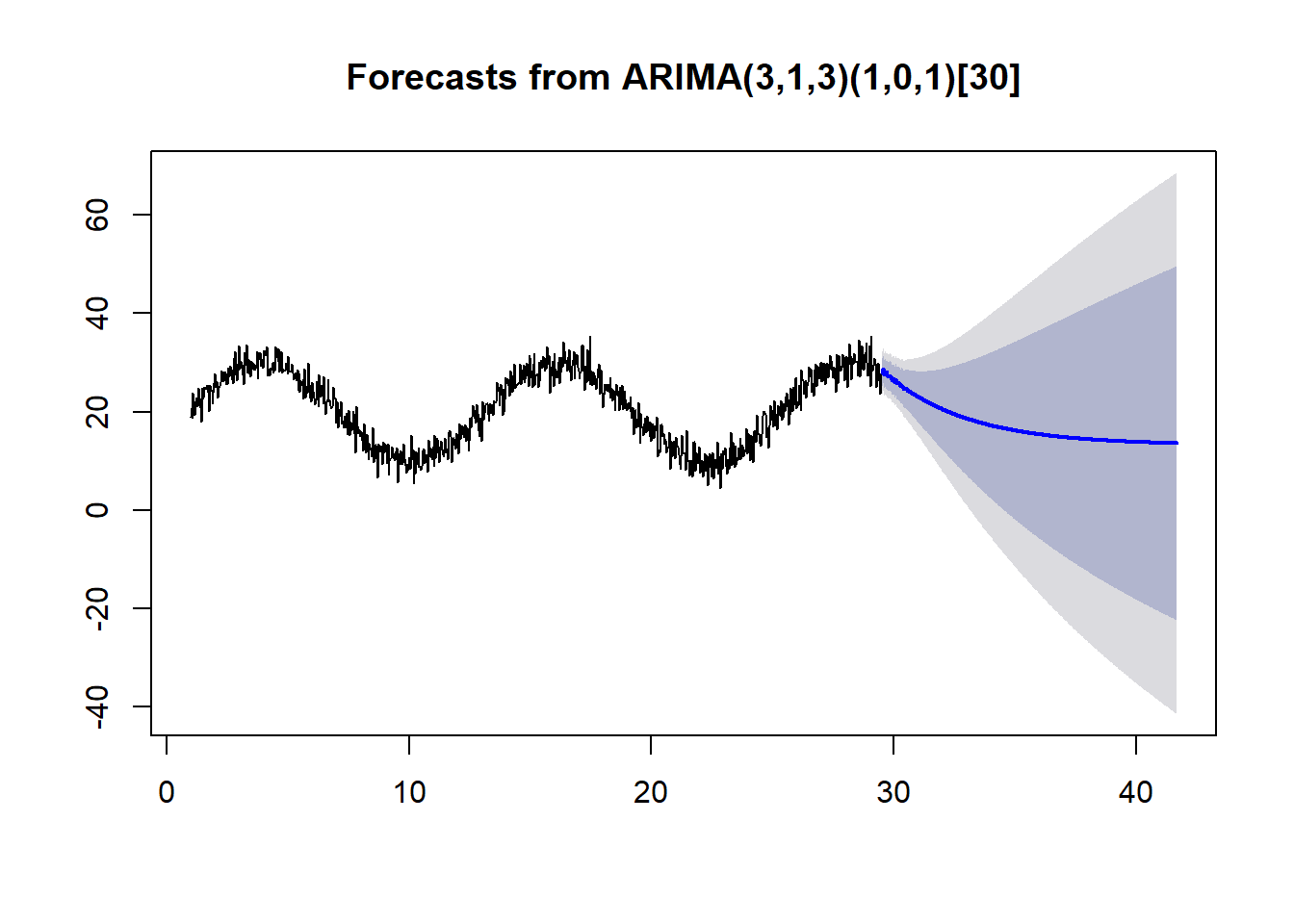
plot(example.b)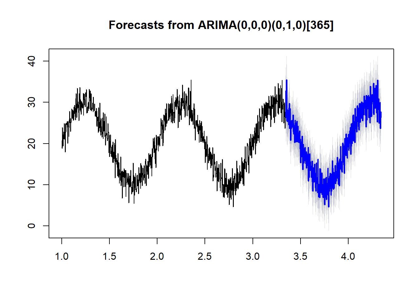
With the proper frequency, auto.arima does a much better job of forecasting.
Using a Weekly Period
The max frequency we can specify in a ts object appears to be only 350. In order to use a weekly period we’ll need to round the data so we have fewer data points per week. I will round the data to a per-hour basis.
#Floor 5 minute intervals to their hour
productivity.data$hour <-  floor_date(productivity.data$time, "hour")
#get average productivity per hour
hourly.productivity.data <- productivity.data %>%
  group_by(hour) %>%
  summarise(avgProductivity = mean(customCleanTs))
#create a timeseries with a predefined frequencey (166 hours in a week)
weekly.custom.clean.ts <- ts(na.omit(hourly.productivity.data$avgProductivity), frequency=168 )
decomp <- stl(weekly.custom.clean.ts, s.window="periodic")
plot(decomp)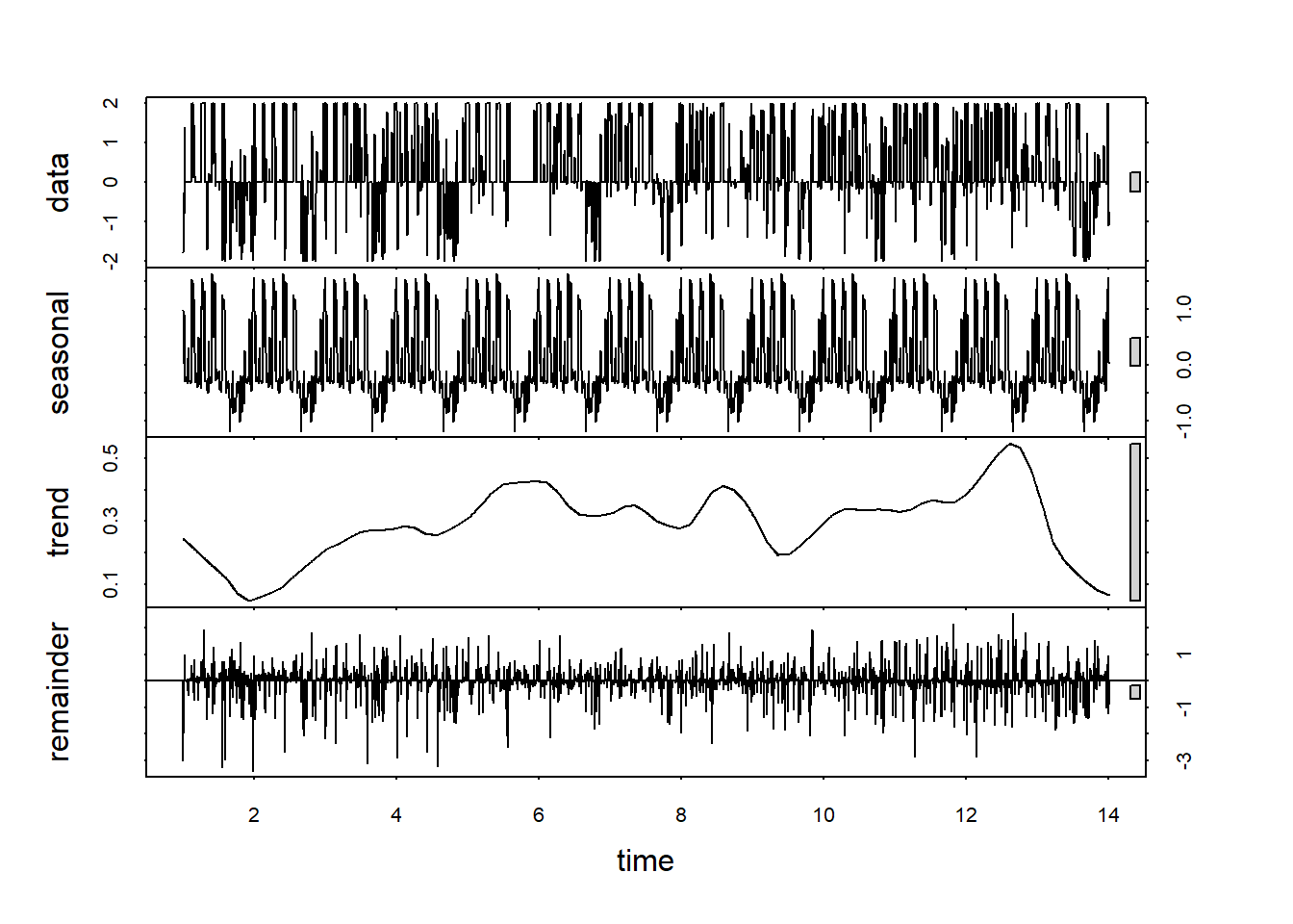
Now the trend line looks more like a trend than a seasonal component.
weekly.fit<-auto.arima(weekly.custom.clean.ts, max.p = 5, max.q = 5, num.cores=4)

weekly.forecast <- forecast(weekly.fit,h=length(test.data))
Now we can inspect our weekly fit the same as we did with the daily one.
tsdisplay(residuals(weekly.fit), main='Residuals')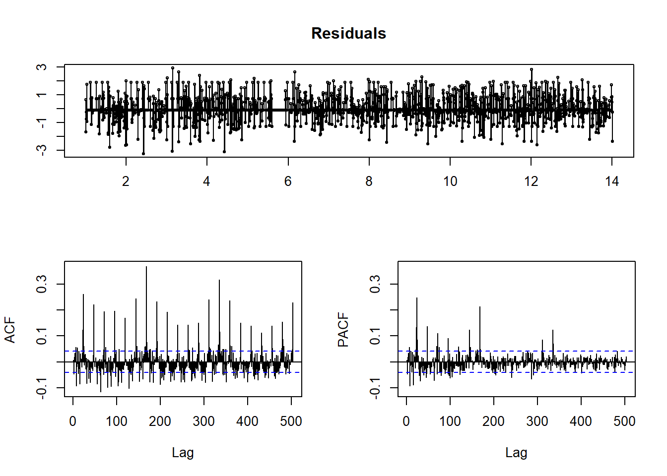
qqnorm(residuals(weekly.fit))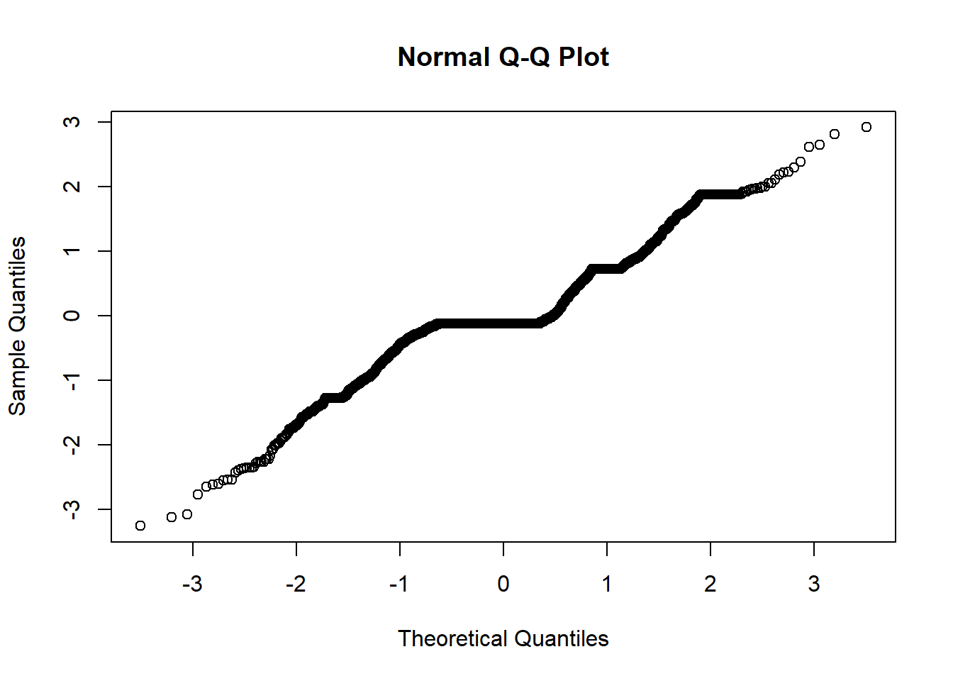
I still see non-ideal residuals, but it is a little better. Let’s see how well we can predict now.
#Create Testing and Training Split
start.date <- "2018-11-19"

start.index <- min(which(hourly.productivity.data$hour > ymd(start.date)))
test.data <- window(ts(weekly.custom.clean.ts), start=start.index)
train.data <- ts(weekly.custom.clean.ts[-c(start.index:length(weekly.custom.clean.ts))])

#fit with training data
weekly.training.fit <-  auto.arima(train.data, max.p = 5, max.q = 5, num.cores=4)

#forecast 1 week of data
train.forecast <- forecast(weekly.training.fit,h=length(test.data))
plot(train.forecast)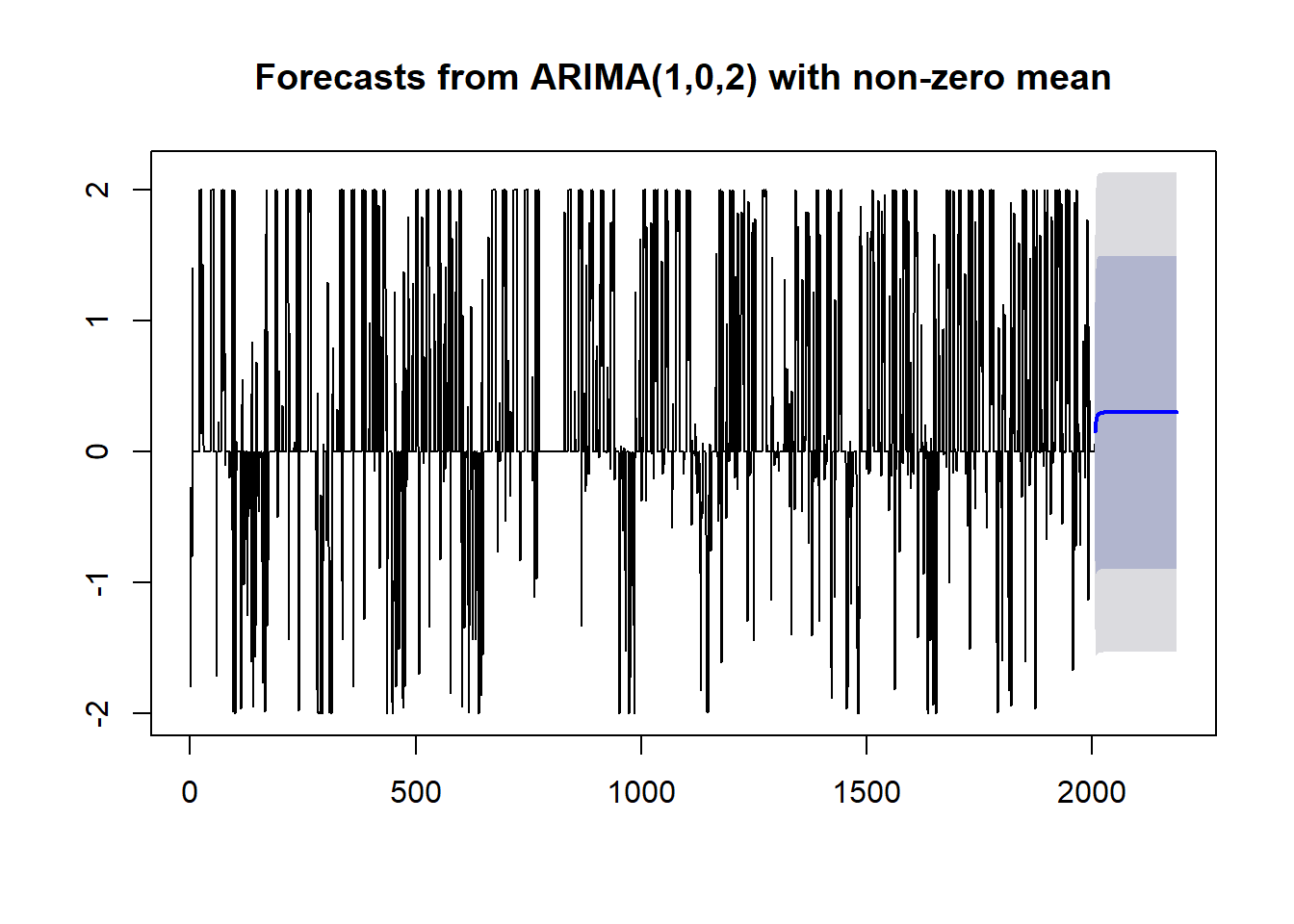
We still see that predictions trend to a constant, but they don’t pick that constant immediately. It’s not what I was hoping for, but it is a little better.
There we have it, productivity predictions from a time series model. It’s fun to test these methods on some non-ideal data. We could do even more data prep and tuning to get better performance, but this shows how simply using auto.arima is not enough. I’m curious to try different models to forecast future personal productivity. Maybe I’ll do another post with different method.